Good bones and road grit.

Garage

Tools, repairs, experiments, and practical jobs best handled with the door open and the radio on.

  • We blamed the browser

    We blamed the browser

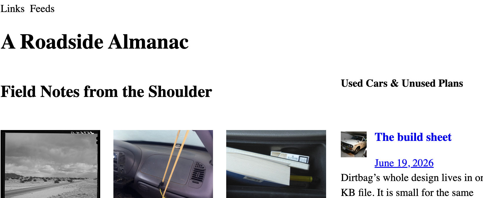
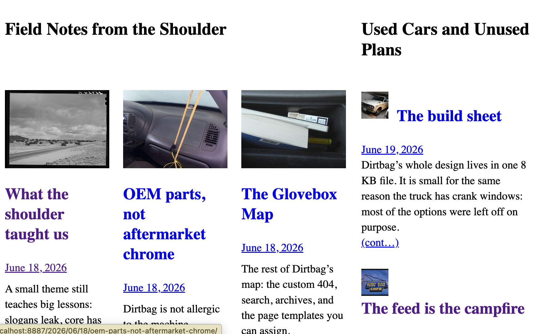
    The sidebar wanted one small thing: a thumbnail on the left with the headline tucked in beside it and the blurb wrapping underneath, the way a magazine sets a column. There is one old, reliable CSS tool for making text wrap under an element: the float. So we floated the thumbnail and moved on.

    It worked. Then it didn’t. In one person’s Chrome, the lower items dropped their headlines below the thumbnail instead of beside it. Not everywhere. Not in Safari. Not in the screenshots our tooling takes. Just there, on that screen, near the bottom of the list.

    That is the worst kind of bug: the one that only shows up in the room you’re not standing in.

    A list of things that were not the problem

    We are not too proud to show the wrong turns, because the wrong turns are the story.

    The cache. First reflex, always. View-source said the stylesheet was correct and current. Hard refresh, no change. Not the cache.

    An extension. Browsers are full of helpful little programs that rewrite the page behind your back. We opened a clean Incognito window. Same break. Not an extension.

    The lazy image. Modern browsers wait to load images that are off-screen, and a thumbnail that loads late could, in theory, knock the layout around. Plausible. We floated an empty box with no image in it at all. It broke exactly the same way. Not the image.

    The size of the box. The thumbnail was sized in a way that could land on a fractional pixel. We pinned it to a round number. Still broke. Not the box.

    The screen itself. The break only happened on a laptop set to a scaled, high-readability resolution, and was fine on an external monitor — so surely it was the odd pixel ratio of that display. We checked the number the browser reports. It was a clean, ordinary 2. Not the screen.

    The fancy grid. The two front-page columns are lined up with a newer CSS feature called subgrid. Exotic features are usually the first thing to suspect. We tore it out. Still broke. Not the grid.

    By now we had a confident, well-documented theory: a browser bug. The float, deep in a tall narrow column, simply wasn’t being laid out correctly until something forced a redo — and scrolling fixed it, which is exactly how those engine-level glitches behave. We wrote it all down, shipped the boring layout that didn’t use a float, and tipped our hat to a Chrome bug we couldn’t beat.

    We were wrong. Comfortably, thoroughly wrong.

    The smaller you make it, the louder it gets

    The only way to accuse a browser and mean it is to reproduce the problem with nothing else in the room. No WordPress, no theme, no plugins — a single HTML file with a float and some text, and a way to flip one variable at a time.

    So we built that page. A floated box, several stacked items, a tall narrow window, and a switch for each suspect: with the grid and without, with the image and without, real float versus empty box. We added one more switch almost as an afterthought — a switch that turned a plain text link into the exact kind of link WordPress wraps a post title in.

    Every other switch did nothing. That last one did everything.

    With the WordPress-style link, every item stacked. Flip it back to a plain link, and every item wrapped perfectly. The browser had been telling the truth the whole time.

    The line that did it

    WordPress styles the link around a post title as display: inline-block. That sounds like a detail, and it is, and it is also the entire bug.

    A normal run of text breaks across lines wherever it must. An inline-block won’t: it is a single atomic tile. Its contents can wrap inside the tile, but the tile itself can’t be split — it can’t take the narrow line beside the float and finish on the full line below. So once it is wider than the gap beside the float, it abandons that gap and drops whole to the next clear line, under the float.

    Which titles are widest? The long ones. Which items had the long titles? The ones lower in the list. Narrow the window and the gap beside the float shrinks, so more titles tip over, from the bottom up. Every spooky symptom we’d catalogued — lower items, narrow screens, breaks from the bottom — was just a long unbreakable title running out of room. Nothing was below the fold. And once the inline-block was in plain sight, none of it needed a browser-engine theory at all.

    The fix is one line. Tell the title link, in this one spot, to behave like normal text again:

    .sidebar-content:not(.is-grid) .sidebar-entry > .wp-block-post-title :where(a) {
      display: inline;
    }

    The float has worked on every screen since.

    That inline-block isn’t really ours to fix, though — it ships with WordPress itself, on every post-title link. So we filed it upstream (WordPress/gutenberg #79372) and asked the obvious question: is the atomic box load-bearing, or would plain inline do the job? Until that’s answered, the one-line override is the honest patch.

    What we actually learned

    We kept both layouts — the magazine float and the plain grid — behind a single class: drop is-grid on the sidebar and it swaps to the boxy, beside-not-under version. Pick the look; the wrap-under is no longer a gamble.

    But the layout is the souvenir, not the lesson. The lesson is older than CSS.

    We spent days interrogating everything around the problem — the cache, the screen, the browser, the network — because those are the suspects you can blame without admitting the call is coming from inside your own stylesheet. The browser was the convenient villain precisely because it was the one thing we couldn’t open up and read.

    The minimal reproduction is the boring, unglamorous move that ends these arguments. You strip the problem down until there is nowhere left for it to hide, and somewhere in the stripping the real cause stops being a theory and starts being a line number. We should have built the small page on day one. We built it on day five, and it answered in about a minute.

    Blame the browser last. It is almost never the browser. It was a coat of paint we’d inherited and never thought to scrape.

  • The price of a pun

    The price of a pun

    Every post on this site is signed the same way: From [author]’s dashboard. It is a small joke. A dashboard is where you keep your hands at ten and two, and it is also where WordPress keeps its knobs. The byline drives both meanings at once. Cheap pun, paid for once, runs forever.

    Except it didn’t run. On a narrow screen the byline kept throwing a rod.

    The apostrophe that wouldn’t stay in its lane

    Read it back: From Roadside Archivist’s dashboard. Three pieces — the word “From,” the author’s name, and the suffix “‘s dashboard.” On a wide screen they sit in a row like they should. Shrink the window and the last piece would snap off and drop to the next line, stranding an orphaned ‘s dashboard under a name it no longer belonged to.

    A possessive that loses its noun is not a typo. It is worse. It reads like the page forgot how grammar works.

    So either the joke had to go, or the apostrophe had to learn to stay glued to the name.

    How you glue an apostrophe to a name

    The byline is a flexbox — a little horizontal rack the three pieces ride in. Two settings hold it together.

    First, flex-wrap: nowrap: the three pieces are forbidden from breaking apart from each other. They travel as one unit or not at all.

    Second, a single line in theme.json: .byline { flex-shrink: 0 }. That tells the layout the byline will not be squeezed thinner to fit beside the date. When it doesn’t fit, the whole byline drops to its own line — intact — instead of shedding its tail to make room.

    There is a third thing, and it is a quirk, not a setting. Flexbox quietly eats the whitespace between its items. So the gap that would normally sit between the name and the “‘s” — the gap that let it break in the first place — simply isn’t rendered. The apostrophe ends up flush against the last letter of the name, like it was never two separate pieces of markup at all.

    Three small moves, and Archivist’s holds together down to the phone.

    What the joke costs

    Honesty time, because that is the house style.

    The byline is a split string. The translator gets “From” and “‘s dashboard” as two separate scraps wrapped around a name they never see. A language that builds possessives differently — or builds sentences in a different order — can’t just swap the words. It has to rephrase around a hole.

    It is also a CSS escape. Dirtbag keeps almost no hand-written CSS, and this spends two of the precious lines, both with !important on them — the layout equivalent of raising your voice.

    And it leans on that flexbox whitespace quirk, which is real and well-defined but is still a behavior, not a promise. Push the screen below about 340 pixels with a long enough name and the unbreakable byline will run off the edge rather than wrap. A short name never notices. A long one on a tiny phone does.

    None of it is free. All of it is for a pun.

    Is it defensible?

    Barely. And that is the honest answer, not a dodge.

    It earns the word defensible because it never leaves the property. No JavaScript. No functions.php. No plugin. Just a core block, a translatable pattern, and one small rule in the file where the theme already keeps its design. By Dirtbag’s own rules, it is in bounds.

    But it is the most indulgent thing in the whole theme. The cheaper build was sitting right there the entire time: By Roadside Archivist. Three words, no apostrophe, no split string, no flexbox sermon, translatable in any language without a fight. Every engineering instinct says ship that one.

    We didn’t. We kept the pun, wrote down exactly what it cost, and paid it on purpose.

    The thing under the thing

    Discipline is not never indulging. A site with no indulgences has no voice; it is a spec sheet with a domain name.

    Discipline is knowing the bill before you order. The trouble is the indulgence you take without pricing it — the framework you add because everyone does, the clever thing you can’t explain a month later, the dependency nobody remembers signing for. Those are the ones that total the truck.

    A possessive apostrophe held in place by a flexbox quirk is a flourish. But it is a measured one. We can tell you what it costs, where it breaks, and what the boring alternative would have been. That is the whole difference between a theme with character and a theme that just got away from somebody.

    Keep the joke. Keep the receipt.

  • The build sheet

    The build sheet

    Pop the hood on a block theme and one part is doing most of the steering: theme.json. It is the build sheet — the page that lists which options the theme came with, what is standard, and what the factory will not let you order. Dirtbag’s build sheet is tiny, about 8.7 KB, because most of it says no.

    That is not laziness. It is the whole idea.

    Two columns on the sheet

    There are only two things on a build sheet worth reading.

    The first is settings: what the factory will let you order. These are the controls the editor shows you — the color pickers, the font menus, the toggles.

    The second is styles: what actually rolled off the line. These are the numbers the theme commits to — the type sizes, the spacing, the heading scale.

    Settings is the menu. Styles is the plate. Read them in that order and the whole file makes sense.

    What you can’t order

    Most of Dirtbag’s settings are switched off, and that is the point.

    The bundled design tools are off. The color section turns off the custom picker, the gradients, the duotones, and ships a fixed palette of nineteen named colors — black, white, a row of greys, and the primaries that came packed in with HTML itself. No wheel, no hex field, no “brand purple #6B21A8.” If you have ever run View Source on a 1998 homepage, you already know this palette.

    The fonts are the same story: thirteen web-safe stacks, Arial through Verdana, all of them already on the machine. Nothing gets downloaded. Nothing phones home. The page renders the same whether the network is fast, slow, or on fire in a ditch.

    Shadows: off. Fluid type: off. A short menu is a kind of honesty. It tells you what the theme is for before you waste an afternoon finding out what it is not.

    What’s standard

    The other column is just plain numbers, written down where you can see them.

    Six type sizes, fifteen pixels up to forty-eight. A heading scale that steps down by level — 36, 28, 26, 20, 18, 15 — so an h2 is a smaller voice than an h1 and the screen reader and the eye agree on the outline. Body text at eighteen pixels with a 1.4 line height. A measure of about 42rem, because a line you can actually finish reading is worth more than a line that fills the window. Block gap at 1.4em. Square buttons. Underlined links.

    No cleverness. No per-block paint job. Just the spec, stated once, applied everywhere.

    The one drawer with a wrench in it

    Every honest toolbox has the drawer where the real wrench lives, and Dirtbag’s is a small block of hand-written CSS inside theme.json. Three rules, no more:

    One collapses the gap in a byline so the author and date read as a single line. One recolors the monochrome truck logo per style variation. And the newest one lines up the two columns on the front page so the sidebar’s posts don’t drift a line below the grid when a heading wraps.

    That is the whole drawer. The rule is simple: if you keep an exception, you write it down. Exceptions that live in the dark breed. Three rules in a list, each with a reason, is a thing you can audit on a slow afternoon. A stylesheet nobody remembers writing is how a small theme quietly becomes a big one.

    Why it fits on one page

    A theme.json gets fat when it tries to style every block — a rule here, an override there, a special case for the thing that looked wrong on one screen in one browser one Tuesday.

    Dirtbag’s stays thin because it does the opposite. It decides what not to allow, writes down a short list of numbers, and keeps three honest exceptions. Then it gets out of the way. The browser and WordPress core already know how to render a document.

    The build sheet fits on one page because the truck does not have many options. On purpose. Constrain, then declare. That is the whole theme, and it turns out you can read it in about eight kilobytes.

  • The feed is the campfire

    The feed is the campfire

    A feed is a campfire with no platform bouncer. You pull up, read what is new, and leave when you are done. Nobody needs to know how long you stared at the sparks.

    What Dirtbag exposes

    The old reader-button habit still works: copy a feed URL, put it where you read, and come back when you feel like it.

  • Plain HTML still just works

    Plain HTML still just works

    A reminder that documents are already responsive before we start decorating them.

    <main>
      <article>Hello, road.</article>
    </main>

    That is enough structure for a lot of sites.