There is a WordPress bug small enough to hide in a single character.
Get this markup in the editor by writing out the HTML with the “Edit as HTML” inline block tool:
<strong>He</strong>'s here.You can also type it in the visual editor with the keyboard shortcuts and inline block tools — and it will look OK in the editor, with a purely vertical apostrophe that’s not curled one way or the other.
But on the published post the world sees, the apostrophe curls the wrong way — away from the ‘e’ it belongs to and out toward the ‘s’.
You wanted a contraction. The apostrophe belongs to the word ‘he’. Unpatched, WordPress renders it as an opening single quotation mark instead. Here is the before, exactly as a stock install curls it:
He‘s here.That little curl points the wrong way. It should be ’, the right single quotation mark — the character English uses as a typographic apostrophe in contractions and possessives. Here is the after, the way a corrected wptexturize() renders the very same markup:
Both lines above are typed straight into the page by hand, so they hold still as a reference no matter what runs after them. The whole bug lives in the gap between them: one word, the same markup, a single character apart.
This is not the block editor inventing punctuation. It is older than that. The culprit is wptexturize(), WordPress’s long-running output filter that turns straight quotes, dashes, ellipses, and a few other plain-text marks into nicer typography on the rendered page.
Most of the time, that is what people expect from WordPress. You type plain punctuation. WordPress dresses it up. The trouble starts when the word is split by HTML.
The word got cut in half
wptexturize() does not look at rendered text the way a reader does. It works through the HTML string. To avoid changing things inside tags, it splits the string around markup.
So this:
<strong>He</strong>'s here.starts to look more like this internally:
<strong> | He | </strong> | 's here.The final piece starts with 's. Since the filter can no longer see the e in He, it treats the straight quote as if it begins a quotation. The visible word says He's. The string pieces say: tag, text, tag, quote at the beginning of a new run.
That is the whole bug: the word context fell through the tag boundary.
Dan wrote about this years ago in Apostrophes and Quotation Marks. That post has the useful minimal shape:
<strong>Test</strong>'s
<em>Test</em>'s
One snippet in the article appears to have a small typo — <strong>Test<strong>'s is missing the slash in the closing </strong> tag — but the point is right. A closing inline tag followed immediately by a straight apostrophe is enough to confuse the old text filter.
The whole family of failures
It is not only contractions. Any straight quote that lands right after a closing inline tag can take the wrong curl. These are the shapes people have actually filed since the original 2011 report — single and double closing quotes, possessives, quoted names, and quotes that bump into a block tag, an ellipsis, or non-English punctuation. The first column is what you write; the last two are typed by hand so they hold still:
| The shape | You write | Renders now | Should be |
|---|---|---|---|
| Possessive after a tag | <strong>He</strong>'s | He‘s | He’s |
| Contraction split by a tag | rock</strong>'n'roll | rock‘n’roll | rock’n’roll |
| Closing single quote after a link | '<a>quoted</a>'. | ‘quoted‘. | ‘quoted’. |
| Closing double quote after a link | "<a>quoted</a>". | “quoted“. | “quoted”. |
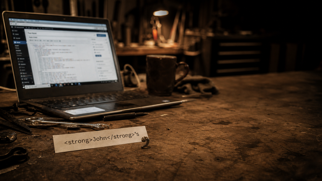
| Possessive after a quoted name | <em>"John"</em>'s | “John”‘s | “John”’s |
| Closing quote before a block tag | "<a>else</a>"</p> | “else“ | “else” |
| Closing quote before an ellipsis | "<a>link</a>"… | “link“… | “link”… |
| Closing quote before CJK punctuation | "<em>引用</em>"。 | “引用“。 | “引用”。 |
A few cousins are genuinely harder and stay out of scope: an opening quote right after CJK text, and elisions where the apostrophe sits before or inside the tag — <strong>l</strong>'homme, <strong>O</strong>'Neill, d<em>'</em>accord. Those are a different boundary problem, noted on the ticket but not fixed by the same rule.
Why this belongs upstream
Dirtbag could try to be clever here. It could disable wptexturize() entirely:
add_filter( 'run_wptexturize', '__return_false' );That would be too much. It would change more than apostrophes: quotes, dashes, ellipses, primes, and old WordPress behavior people may rely on. A theme should not make that decision for a site.
Dirtbag could also patch the rendered content after the fact, flipping ‘ to ’ after certain inline closing tags. That is less blunt, but still a theme pretending to be a typography engine.
The right place is WordPress core. There is already an old ticket for the broader bug: Core Trac #18549, “wp_texturize incorrectly curls closing quotes after inline HTML end tags.” The ticket has a long history, patches, duplicate reports, and the correct diagnosis: wptexturize() loses quote context around inline HTML.
The modern block-editor version of the report showed up again as Gutenberg #42345. It was closed there for the right reason. Gutenberg cannot fix an output filter that lives in core.
So now we’ve finally caught up with that old issue, and the LLMs are good enough to sort out such a thorny logic puzzle.
The useful test
The smallest issue revival comment is not another essay-length comment. It is a test.
/**
* @ticket 18549
*/
public function test_apostrophe_after_inline_formatting_tag() {
$this->assertSame(
'<strong>He</strong>’s here.',
wptexturize( "<strong>He</strong>'s here." )
);
}Then add the neighboring cases:
<em>It</em>'s fine.
<a href="#">Dan</a>'s truck
<strong>rock</strong>'n'roll
And do not overcorrect these:
<strong>Note:</strong> 'quoted text'
<strong>He said</strong> 'go'
That distinction matters. When a closing inline tag is immediately followed by an apostrophe and a letter or number, and the visible text before the tag ended with a letter or number, it is probably a contraction or possessive. When there is a space after the tag, normal opening-quote behavior should still be possible.
The Dirtbag lesson
This is the same kind of bug as the floated-title problem: one default, one tiny inherited behavior, one layout or text result that looks supernatural until the small rule is visible.
A theme like Dirtbag is supposed to stay close to WordPress. That is the bargain. Use core blocks. Use plain HTML. Avoid clever replacements. But staying close also means you get close enough to see the burrs.
This apostrophe is one of them. Not dramatic. Not a crisis. Just a small wrong curl after a tag.
Small wrong things are still wrong.